![]()
![]()
![]()
![]()
![]()
![]()
![]()
![]()
![]()
![]()
![]()
![]()
![]()

"It
is impossible for ideas to compete in the marketplace if no forum for
their presentation is provided or available." ��Thomas Mann, 1896
Color, texture and design
Author:
John Hathaway-Bates
Commissioned and written in 1975 for the Office Planner;
published in the United Kingdom by Benn Brothers Ltd.
Color, texture and design
The
successful office environment combines both well resolved functional
relationships and also a sensitive integration of colors, textures and a
feeling for space. The character and delight of an interior is the result of
the materials chosen and the way they are related. In this article the visual implications of the different colors and
fabrics that may be used in office interiors are explained.
1 Color
Color is governed by its ability to reflect light, and in this context it is as important to consider the texture of an object as it is to choose just the color. A matt but smooth surface will project the truest color in normal conditions, whereas a high gloss or mirror-like surface will distort color and definition. Therefore a carefully prepared color scheme can be drastically changed if surface finishes are changed during installation.
Shiny surfaces are affected most by artificial lighting and the high gloss white skirting board seen in daylight may become a sickly shade of green or blue under fluorescent lighting, or a dirty yellow beneath tungsten lighting. This apparent sudden change when the artificial lighting goes on can seriously affect the productivity level of office staff without their even being aware of it.
Similarly, two samples of cloth, carpet or fabric can appear identical in daylight but become completely different colors under an artificial light, and vice versa. The choice of fabrics and other products that rely upon the dyers' trade needs careful attention and election, unless they will be subjected only to a single type of light source.
A problem also arises in color selection from the inability of most producers to maintain standard hue and chroma and reflective value throughout production. Most reputable manufacturers will agree that a perfect match every time is almost impossible with fibers and natural products, and they take great pains to point this out to prospective buyers. This fact is ignored by those who buy in small lots rather than specify that the whole order must be from one color batch; often this means taking the complete order in one width (e.g. carpet) or over-buying by a small amount (e.g. paint), but this is often the only way that a color constancy can be achieved.
One problem is lack of international color standards and the use of subjective color names (e.g. primrose) which vary from one product to another. However, BS 5252: 1976 is a newly launched framework for color co-ordination for building purposes which provides 237 systematically related colors, from which specific ranges may be chosen. At the same time, three new standards actually utilizing the framework are issued: BS 4900, BS 4901 and BS 4902, giving ranges for vitreous enamel, for plastics and for sheet and tile flooring. BS 4800 for paint colors already exists. It is imperative to know which colors you are talking about before any decision is made, so apply them to all types of light, check with the manufacturers to see if there is any 'standard' color reference available on their products, and discover how long the color will remain available. It is helpful if when fabrics woven from many different colored threads are used, the full range of threads is displayed to make possible 'color-clashes' easier to spot before they are implemented.
Color depends greatly upon the light source to which it is subjected; therefore, apart from deciding which type of light is to be used, one must also give con�sideration to just how much light is needed, bearing in mind the reflective value of the colors used in com�bination with textures employed.
Having identified the largest areas for color treatment (walls, ceiling, floor), it is necessary to determine the density of light on each of the surfaces in all the con�ditions in which the color scheme will be seen. If the window area is large and the ceiling is no more than a short way from the top of the windows, then the ceiling will appear very light (Fig 1); if, however, the windows are small (Fig 2) or end far beneath the ceiling (Fig 3), then the ceiling will appear dark. The treatment must then be used to balance the amount of daylight and light density back to the result required. If the ceiling is in a bad condition or 'waves', then texture must be used to hide the faults, or a new ceiling installed before decoration commences. The brightest room will be one with a high reflective value white finish applied to every surface and an intense light source. However, few offices require such brightness; therefore, having decided upon the color scheme it will be necessary to reduce the reflective value as required by employing varying shades with lower reflective values.
The wall area which will have the highest reflective light will be that one which is opposite the windows; it may be considered the 'face wall' and can be used to display the 'feature material' of the designer's choice. The wall with the least reflective light will be that in which the windows are situated; this area should be the highest in reflective value and lightest in color to promote light entrance.
It must always be remembered when planning the colors and reflective values of the wall and floor areas that the furniture used may reduce or increase the effect of your color scheme. A wall against which a variety of shapes and heights in cupboards and cabinets will be placed should have a low reflective value which will not increase the optical disorder of these shapes by reflection light. At best it should be highly textured so that shadows and reflections from the furniture are not so obvious.
If highly reflective horizontal surfaces (such as worktops etc) are to be used, the ceiling should have a reduced reflective value to keep down any possible glare, and a light intensity provided by direct light source which can be regulated to the desired requirements. In rooms with low daylight source, mirrors on the adjacent wall (that which runs at right angles to the 'light sources') can increase the reflection without giving excessive glare.
Natural light is 'colored' by the path through which it runs; therefore, if the windows face on to open countryside with high density tree cover the light will be 'greened' and this light is recognized by most people as 'natural light' in the folklore sense. Artificially, this light can be reproduced by the use of green plants within the scheme, or by making sure that green foliage grows outside the window.
2 Use of patterns
Patterns need to be considered with some care; too great a use in area or complexity of patterns can lead to a 'kaleidoscope effect' which can hamper concentration. At the same time, however, patterns can assist in concentration and give character to an otherwise characterless room by careful application. Patterns should either match-in with the overall color scheme or be used as a separate color feature in a room where the remainder of the scheme is plain and simple in color usage. Fashions are apt to change for patterns much faster than they do for natural or plain color finishes (usually promoted by the manufacturer to keep up sales), but whatever the reason, you should be careful to choose a pattern, which will last (e.g. traditional or historical) and leave the 'experiments' to situations where re-decoration and re-furnishing is on a shorter cycle.
There are problems in other respects, such as fading and replacement, and therefore the use of patterns needs careful planning.
A pattern by its very being is of different colors, an each color will have a different fading rate from its neighbor; this is especially true in the case of carpets and fabrics, so it is wise to have some knowledge of what you may expect.
Since patterns are subject to a very fast fashion turnover, replacement or repair can be difficult; therefore sufficient material should be stockpiled to overcome this problem from the outset.
Patterns are bound to use more material than plain colors since you need to obtain a pattern match installation and use; of course as the pattern repeat varies, so also does the wastage. It is wise to know just how much bought material is likely to be thrown away.
3 Texture
Texture can be a very important tool when planning an office environment, in that it can create illusion while performing a worthwhile task at the same time, worth studying the disadvantages of using text materials from the point of view of lasting appear and performance. Some points to think about decision-making time includes the following:
-
Loose weave fabrics are liable to catch on things and are by their nature more likely to be damaged and to show that damage.
-
Horizontal-grained textured materials will catch airborne dust; if the material is flimsy or has a soft surface, removing this dust may cause damage.
-
Fabric upholstery is less likely to give a “shine” to worsted clothes worn by your staff and visitors but vinyl upholstery is normally easier to keep clean.
-
Soft surface products are more likely to show wear and damage than hard surface products; therefore walls which are liable to be 'bumped' should' clad with either a hard-surfaced product or one which can be replaced economically and without too much bother or interruption of the routine.
-
Textured products fall into two types when considering color; that which is dependent upon 'applied color' (e.g. a product which is dyed painted), and that which depends upon its natural color (e.g. natural wood or cork). The first must be considered as an integral part of the color scheme and treated with the same rules as other products used, whereas the latter is considered an 'additional color' and should be treated as such in color planning.
-
From the very simplified assumption that light and noise 'flow' much as water, it is possible to judge the performance of textures within a scheme from this rule of thumb formula. Water thrown at a smooth highly gloss surface will 'bounce back' without much loss of volume whereas water thrown at a sponge will be partly absorbed. Treating sound and light on the same principle, noise or light being 'bounced' off a highly textured surface will also lose some of its volume due to absorption. Therefore a spongy surface (e.g. panels of cork granules) will absorb much more noise and light than a surface treated with gloss paint.
Textures can be graded to establish their effect upon a color scheme by the following method:
No texture: These are products which are of one color and are flat to the eye, giving an even reflective value and smoothness to the touch (e.g. paint, plain wallpapers, grained and patterned finishes with a high reflective value and smooth fabrics where the weave is very fine).
Implied texture: These products imply texture by the use of mixing color or printing patterns or grains on to a low reflective flat surface (e.g. wood-grained printed wallpaper and plastics, real wood, Hessian prints).
Light texture: These have varying depths of texture between the flat base and 1mm standing (e.g. reed-weave, multi- or two-toned Hessians, cork tiles, PVC products and chip papers).
Medium texture: Here the depths employed range between the flat base and 2mm standing and can include some of the lesser standing depths where the base color and applied surface color are strongly contrasting (e.g. light reed weaves on dark bases, grass weaves, granulated cork tiles, rough wood or heavy fabrics).
High texture: Here the difference between flat base surface and 5mm standing is employed (e.g. mica chip paper, sculptured timber, rough stones). Heavy texture: Here the face may stand proud by anything above 5mm (e.g. very rough stone, carved wood screens, sculptured timbers, mosaics).
4 Light reflection and color
To calculate the reflective values of the colors used in any color scheme, it is necessary to determine the area and density of natural light by calculating the area of the light source and using a light meter to discover its actual strength.
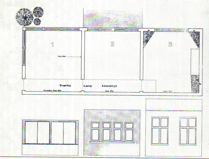
As an example, assume that the window height in all three offices is exactly the same, i.e. the windows start 1m from the ground and finish 30cm from the ceiling. Therefore 22.5% of the wall area in Office 1 can be considered as light source. The light source in Office 2 is 12% and the light source in Office 3 is 9%; therefore for an overall reflective value of 80%, the following colors giving an average reflective value for the three offices would be required:
In Office 1 57.5%
In Office 2 68%
In Office 3 71%
This could be made up in Office 1 by giving a reflective value of 80% on the window wall and a combined value of 35% to the other walls. Office 2 could have a reflective value of 80% on the window wall and a combined value of 56% on the other walls, and Office 3 80% on the window walls and 62% on the other walls. This rough guide illustrates the use of reflective values within a color scheme. In Office 2, by direct reflection, it is obvious that the wall opposite the windows must be the face wall.
In Office 3 the wall opposite the window would also be the face wall but due to the natural shadows the face wall in Office 3 would of necessity have to be of higher reflective value in Office 2. In Office 1, because two walls have windows, the designer is presented with a face wall and a secondary face wall.
For color or texture, Office 1 would be considered to have only window walls and face walls. Therefore Office 1 in color design does not have the normal two types of wall in terms of color treatment as exist in Offices 2 and 3.
The color of floor coverings must also be related to considerations of wear, soiling and necessary cleaning. The density of wear confined to traffic lanes must play a great part in any decision on color; i.e. Office 1 has three times the wear in the major traffic lane compared with Office 3, and Office 2 has twice the wear of Office 3. Therefore, if a uniform color scheme is employed in linking offices, color choice must be based upon the heaviest wear per traffic lane (Office 1) and not on the lightest wear (Office 3).
4.1 Loss of space by shadow:
A room with excessive shadows will look smaller. Therefore it is necessary to eliminate or control these areas of shadow which exist through the necessity of building design or placing of equipment and furniture, In office 3 there are three major areas illustrated where the problems of shadows from the natural daylight source by optical illusion diminish the size of the room. There are three ways of partially overcoming this problem. The window wall could be painted white or another very light color to reflect light into the room; however, this would depend on the other colors used in the design and their reflective value. Or one could employ very light drapes in position (a). You could also use a mirror on wall area (b) from floor to ceiling, but the best answer would probably be to use wall lights centrally placed in positions (a) and (b).
A room with excessive shadows will look smaller. Therefore it is necessary to eliminate or control these areas of shadow which exist through the necessity of building design or placing of equipment and furniture, In office 3 there are three major areas illustrated where the problems of shadows from the natural daylight source by optical illusion diminish the size of the room. There are three ways of partially overcoming this problem. The window wall could be painted white or another very light color to reflect light into the room; however, this would depend on the other colors used in the design and their reflective value. Or one could employ very light drapes in position (a). You could also use a mirror on wall area (b) from floor to ceiling, but the best answer would probably be to use wall lights centrally placed in positions (a) and (b).
4.2 Exterior influence:
Office 1 has an outlook on to trees, and some natural vegetation. However, the major�ity of the ground area is paved or bare; therefore the natural light is influenced by the trees when they are in leaf (greened) and in the winter months by the darker colors of the paving, the bare ground and the leafless trees (grayed).
Office 2 has few trees but faces on to a grassed area; therefore throughout the year the light is affected by this (greened).
Office 3 faces on to a city road and the building opposite; therefore the light is reduced and influenced by the colors of the building.
The simple answer to these external influences would be to increase the light in Office 1 and Office 3 and reduce the light in Office 2 in comparison. Colors to be avoided in Office 1 would be dark colors of the green/blue section of the spectrum with an increase in colors in the yellow/brown of the spectrum. In Office 2, eliminate green, yellow and blue and intro�duce reds/browns. In Office 3, eliminate the dominant reflective color of the buildings opposite; e.g. if red brick eliminate reds, if concrete eliminate blues, and introduce warm colors within the brown to yellow part of the spectrum.
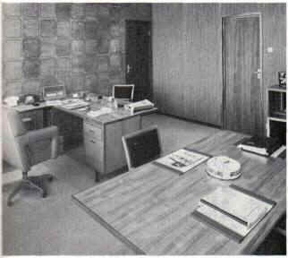
Left, typical
office interior (picture by courtesy of Hella Automobile Equipment Ltd.);
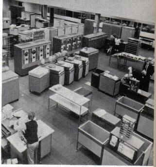
Right, computer hall at International Computers Ltd. premises at Bracknell,
England.
Interior
Design by: John Hathaway-Bates.
 Search Our Site
Search the ENTIRE Business
Forum site. Search includes the Business
Forum Library, The Business Forum Journal and the Calendar Pages.
Home Calendar The Business Forum Journal Features
Concept History Library Formats Guest Testimonials
Client Testimonials Search News Wire Why Sponsor
Tell-A-Friend Join Experts Contact The Business Forum
The Business Forum
Beverly Hills, California United States of AmericaEmail: [email protected]
Graphics by DawsonDesign
Webmaster: bruceclay.com
� Copyright The Business Forum Institute - 1982 - 2013 All rights reserved.
The Business Forum Institute is not responsible for the content of external sites.
Read more